
Your brand logo is one of the first few things your customers will encounter when interacting with your brand. It acts as the visual cornerstone of your business– that encapsulates its identity, values, and aspirations in a single, compelling image.
Every business owner wants to create a logo that is not only visually appealing but also effectively communicates the essence of their brand. After all, a well-designed logo goes beyond aesthetics. It should boost brand recognition and differentiation in a crowded marketplace.
That’s why creating one that is memorable and eye-catching is not a walk in the park, but this article listed best practices in logo design. From the choice of colors and fonts to the symbolism embedded in every curve and contour, we’ll explore how each element plays a crucial role in shaping the perception of your brand.
1) Simplicity is Key
Keep your logo simple and uncluttered. You might think that the more complex your logo is, the more sophisticated your brand looks. However, the reality is that a clean design is more memorable and versatile across various platforms.
A way-too-complex logo design can overwhelm viewers and dilute the impact of your brand message. By keeping it simple and uncluttered, you allow your brand to convey a sense of clarity and immediate recognition. A straightforward logo not only makes a stronger visual impact but also ensures that your brand message is easily understood
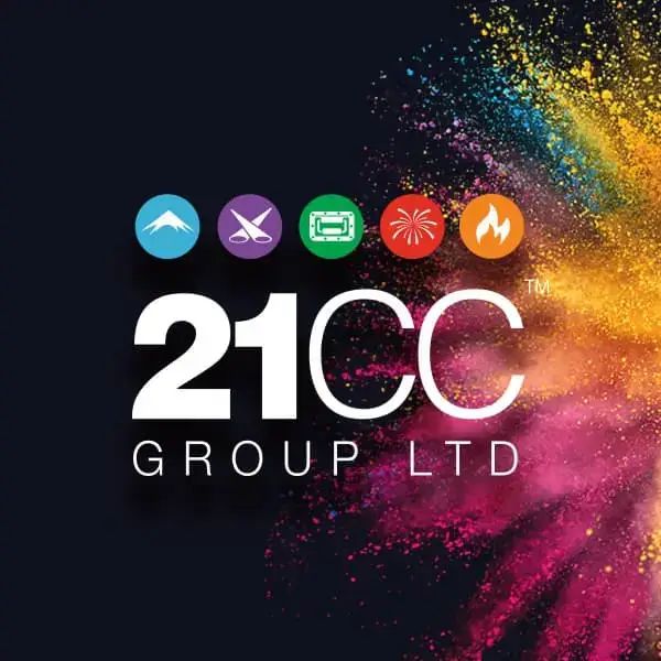
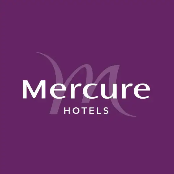
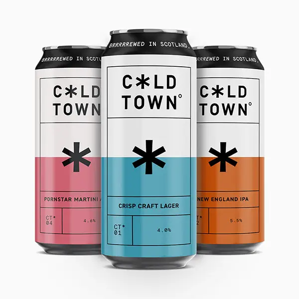
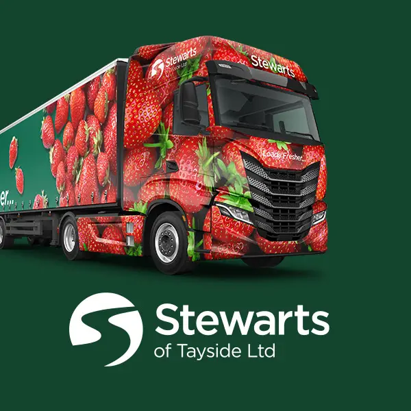
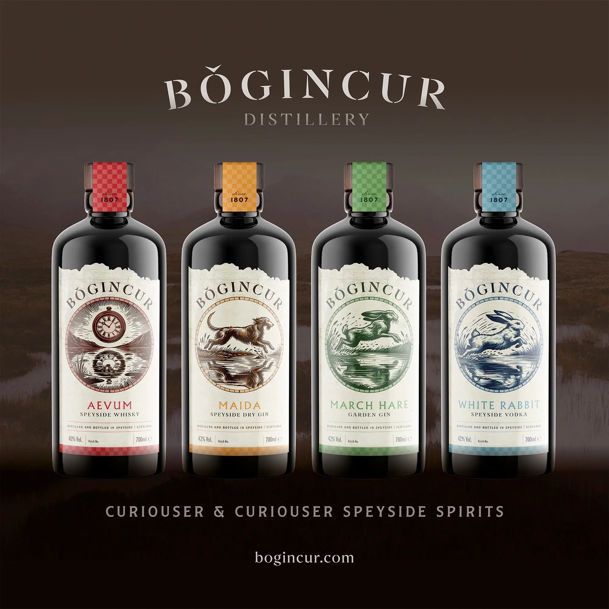
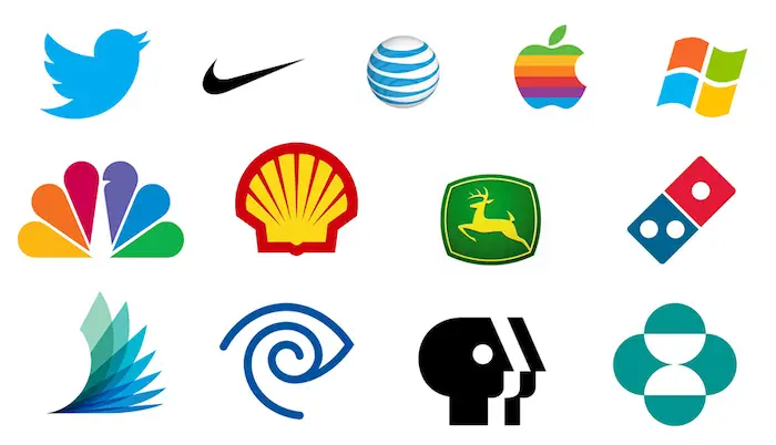
We can see that most big brands we know opt for clean and simple logo design:
2) Don’t Rely on Trends
Design trends come and go, hence being a trend. Some trends endure, while others are fleeting fads. While it’s crucial to stay ahead of the latest design movements, leaning too heavily on them can result in your logo and brand quickly appearing outdated.
It’s always best to create a logo that stands the test of time. Timeless logos often incorporate classic design elements that have proven aesthetic appeal over the years. These elements may include simple shapes, clean lines, balanced proportions and captioned images, contributing to a design that doesn’t succumb to the whims of passing fashions.
Of course, you can always redesign your logo once you think it’s become outdated or no longer aligns with your evolving brand identity. However, frequent redesigns can lead to brand confusion and dilution of brand equity.
Therefore, while redesigning is an option, it’s essential to carefully consider the lasting impact of your logo and strive for a design that remains relevant and resonant.
3) Make It Relevant to Your Business
Your logo should be a visual representation of your brand’s identity. It should encapsulate the values, personality, and unique selling propositions that define your business. When customers see your logo, they should instantly connect with what your brand stands for.
Different industries often have distinct visual languages and symbols. Adhering to or subtly subverting these conventions can help your logo communicate more effectively within its specific context.
4) Appropriate Colour Choice
Choosing the right colours for your logo allows you to evoke specific emotions that align with your brand’s personality. For example, blue may convey trust and professionalism, while red can evoke energy and passion.
Consistency in colour across various brand assets fosters recognition and strengthens the association between the colour palette and your brand. This cohesion is vital for building a memorable and cohesive brand image.


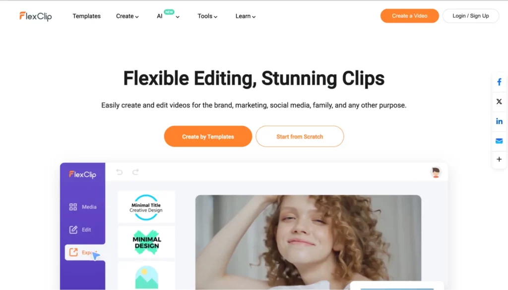
You can design a website that has the same colour scheme as your logo to create a harmonious visual experience for your audience. This is what FlexClip did. They use orange as the predominant colour in both their logo and website, creating a seamless and visually cohesive brand identity.
This consistency reinforces FlexClip’s brand identity and makes it instantly recognizable across different touchpoints. When users visit their website and encounter the familiar colours from their logo, it establishes a sense of continuity and strengthens the connection between their online presence and brand personality.
5) Versatility
A versatile logo should be scalable, meaning it looks just as good whether it’s displayed in a small size, such as on a business card, presentation design, or a social media icon, or in a larger format, like on a billboard.
Also, your brand logo should be designed to work well in both colour and monochrome (black-and-white or grayscale) formats. This flexibility ensures that your logo can be effectively reproduced in situations where colour may not be feasible or necessary.
Whether it’s printed in black and white or featured in a publication that restricts colour usage, the essence of your logo should be retained.
6) Typography Matters
Different fonts evoke distinct emotions and convey specific traits. In other words, The typography sets the tone for how your brand is perceived. For instance, a bold and sans-serif font may suggest modernity and strength, while a script font can impart elegance and sophistication.
Consistent use of typography across various brand assets fosters recognition and reinforces brand consistency. Whether it’s on your logo, website, or marketing materials, maintaining a cohesive typography style contributes to a unified brand image.
Each industry may have certain typographic conventions that help convey professionalism or specific brand attributes. Familiarising yourself with these standards and incorporating them into your logo can create a sense of familiarity within your industry while still allowing room for differentiation.
7) Test It on Different Mediums
We’ve talked about versatility before. Before you finalise your logo design, it’s crucial to put it to the test across different mediums to ensure its adaptability and effectiveness in diverse contexts.
Assess how your logo appears on digital platforms, including your website, social media profiles, and email signatures. Verify that the colours display accurately across different screens and devices.
Designing a logo that looks impressive on a computer screen is just the first step, though. The true measure of its success lies in how well it translates across various mediums and applications.
So, don’t forget to test your logo on printed materials such as business cards, brochures, and stationery. Evaluate how it appears in various sizes and whether fine details are retained when printed. Assess its readability from a distance and verify that it maintains clarity when scaled up.
Wrapping Up
Every curve, colour, and element in your logo plays a role in shaping perceptions and influencing consumer behaviour. That’s why creating a logo that stands the test of time requires more than just design skills. It demands an understanding of your brand’s identity and a strategic approach to visual storytelling. With those best practices above, you now understand the keys to crafting a logo that resonates with your audience, fosters brand loyalty, and propels your business to new heights.